No items found.
More Info
The collaboration began when Kate came to visit our Studio, and upon picking up a palm sized bronze sculpture, remarked on its substantial weight.
Dancing figures, lotus forms and layered silhouettes developed into an illustrated packaging and print system.
The Blue Lotus stones and pebble sets sold out completely, and the collection was covered by WWD. The collaboration increased the KHIRY total subscribed email list by 10%.
Illustration, graphic design, printed packaging and visual identity for the Dancing Lotus collaboration.
Illustration, graphic design, printed packaging and visual identity for the Dancing Lotus collaboration.
Print Design Process
Initial Concept Sketch
Distinct feminine forms, move in unison. Figure style draws upon the KHIRY Moving Together Motif, Aaron Douglas Paintings, and Matisse's Dancing Ladies
V1
The initial translation of this idea was designed to fit a full sized version of Kate Mcleod's body stone, which is sold in a bamboo twist-top canister. The sleeve design meant the need for a very wide and short composition.
I first thought it might save time to integrate AI directly in the composition. I generated several images using illustration prompts for characters in different types of motion that told the story of the collaboration; dance, meditation+ yoga, and activism. I selected aspects of the generated images and composited them using Procreate, to form an initial composition to fit the unique aspect ratio.
V2
Still, upon review with the KM team, we agreed that the resulting graphic wasn't cohesive enough, and didn't fully deliver on the simplicity, ease, modernity and emotionality of the first rough sketch. Thus, I decided to draft an original composition by hand. I used a tonal color palette that delivered a clear mood of, while employing some signature aspects of Aaron Douglass' painterly style to create visual depth and space for a range of characters and scenes. This version was adopted for print.
"Our Peace, Our Power"
V3
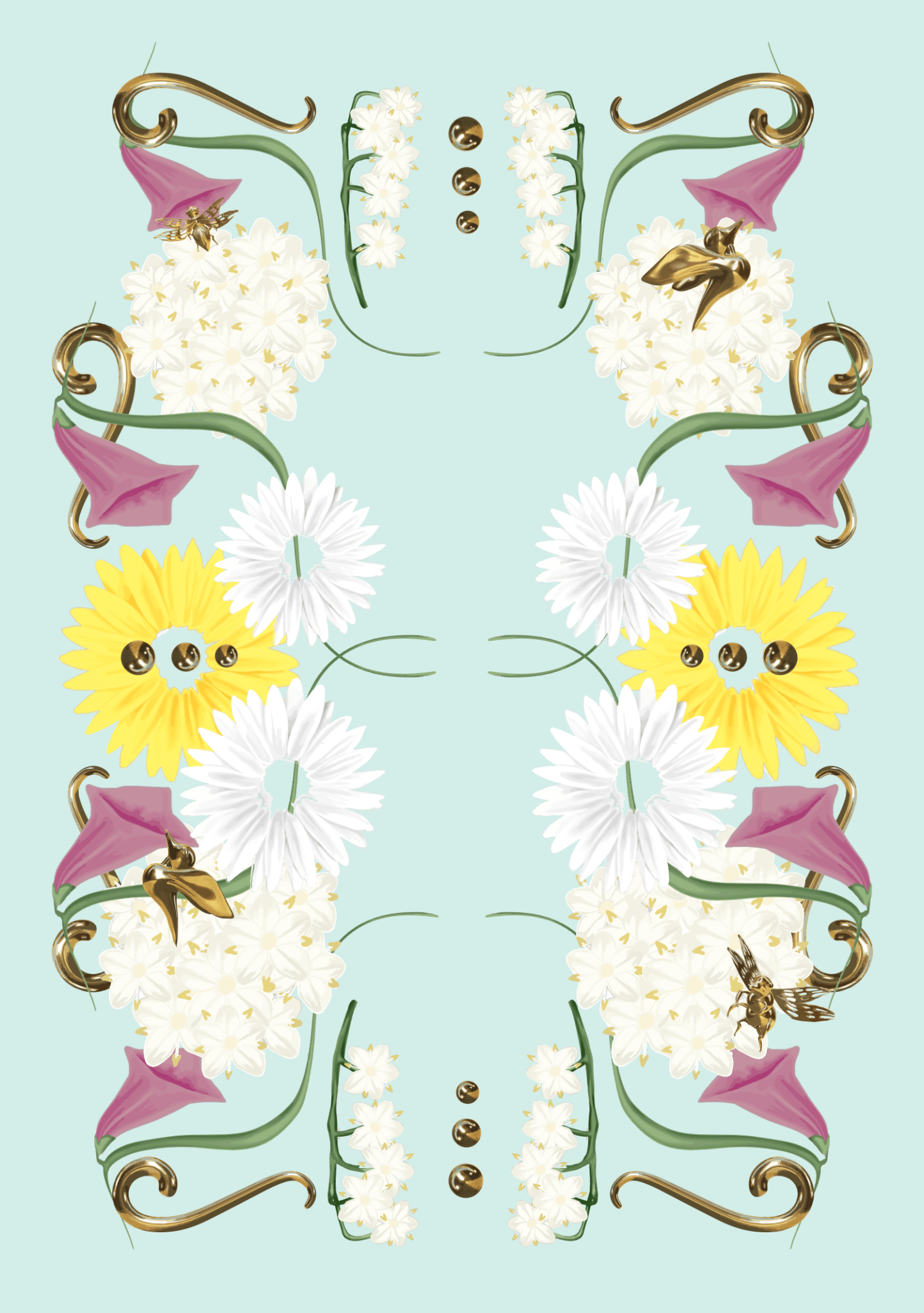
Ultimately though, the packaging direction shifted to meet margin and timeline constraints, from the bamboo canisters to a flat sleeve pull-out box design. The brief shifted to incorporate a repeat pattern, with more prominent use of the lotus motif. My First pass was the below:
V Final Vector
Print Design Process
Initial Concept Sketch
Distinct feminine forms, move in unison. Figure style draws upon the KHIRY Moving Together Motif, Aaron Douglas Paintings, and Matisse's Dancing Ladies
V1
The initial translation of this idea was designed to fit a full sized version of Kate Mcleod's body stone, which is sold in a bamboo twist-top canister. The sleeve design meant the need for a very wide and short composition.
I first thought it might save time to integrate AI directly in the composition. I generated several images using illustration prompts for characters in different types of motion that told the story of the collaboration; dance, meditation+ yoga, and activism. I selected aspects of the generated images and composited them using Procreate, to form an initial composition to fit the unique aspect ratio.
V2
Still, upon review with the KM team, we agreed that the resulting graphic wasn't cohesive enough, and didn't fully deliver on the simplicity, ease, modernity and emotionality of the first rough sketch. Thus, I decided to draft an original composition by hand. I used a tonal color palette that delivered a clear mood of, while employing some signature aspects of Aaron Douglass' painterly style to create visual depth and space for a range of characters and scenes. This version was adopted for print.
"Our Peace, Our Power"
V3
Ultimately though, the packaging direction shifted to meet margin and timeline constraints, from the bamboo canisters to a flat sleeve pull-out box design. The brief shifted to incorporate a repeat pattern, with more prominent use of the lotus motif. My First pass was the below:
V Final Vector